Overview
The Indian Puja Box, launched by Temple Connect, is a comprehensive spiritual kit that contains all the essentials for performing a traditional Hindu ritual. While working with Tricycle Brand Solutions, the goal was to systematize this process through intentional design, ensuring that both the physical arrangement and visual elements aligned with the emotional and symbolic journey of worship. The visual language was developed around the sacred rhythm of the ritual itself, beginning with purification, transitioning through active devotion, and ending with symbolic reaffirmation. The graphic and structural design supported this flow, using order, texture, and tone to guide the devotee’s experience and deepen engagement.
Skills Used
Packaging Design
Illustration
Industry
Spiritual Goods
The Challenge
Designing for a religious practice came with a responsibility to preserve authenticity while also crafting an engaging, navigable visual system. The first challenge was to arrange over twenty items in a way that felt intuitive, respectful, and rooted in ritual chronology. At the same time, the design needed to communicate across generations, appealing to both traditional users and younger, modern practitioners. Cultural accuracy, spatial constraints, and symbolic clarity had to be balanced within a format that was both compact and visually expressive. Each design decision was held to the high standard of devotion — nothing arbitrary, everything intentional.
The Solution
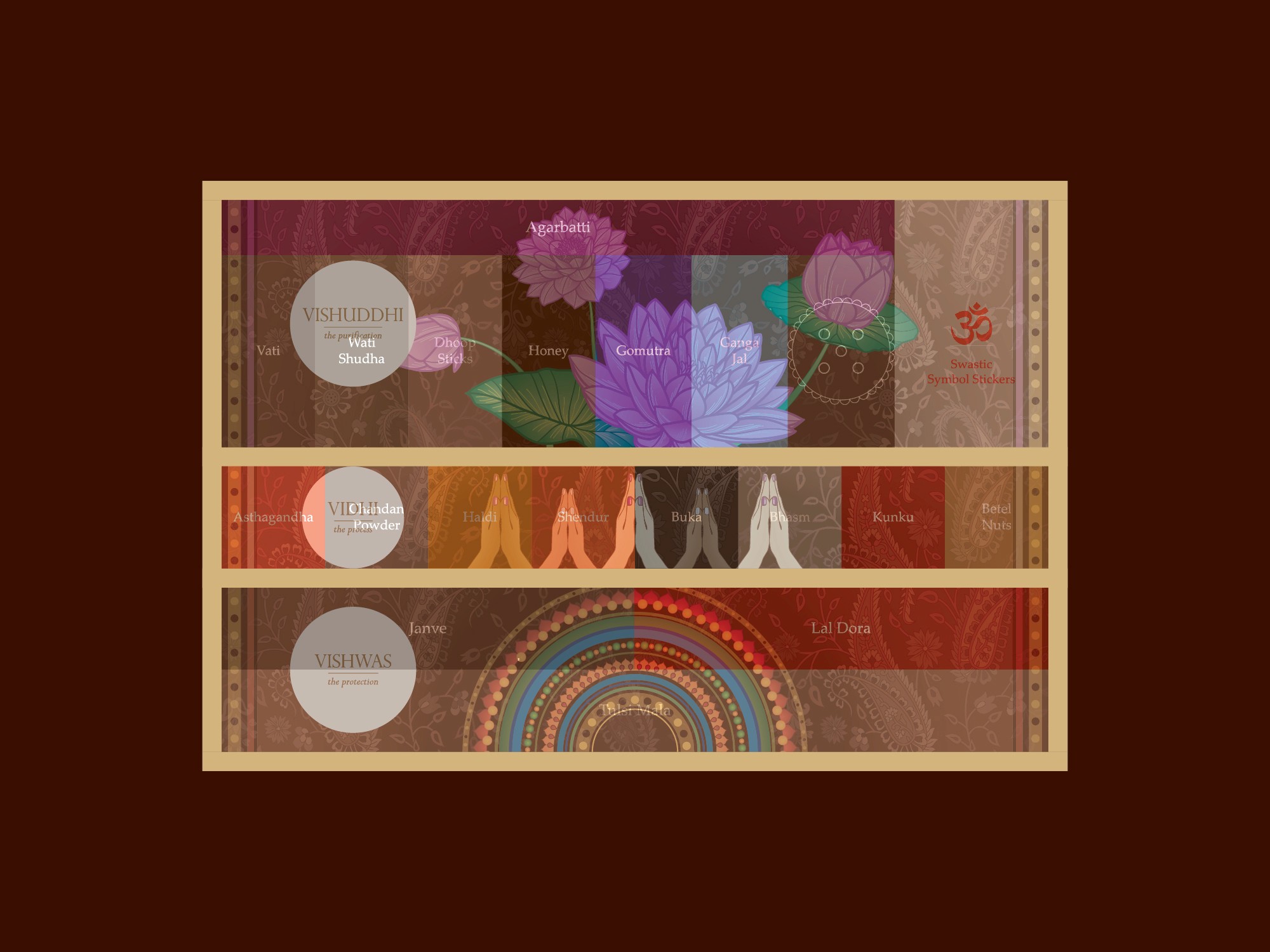
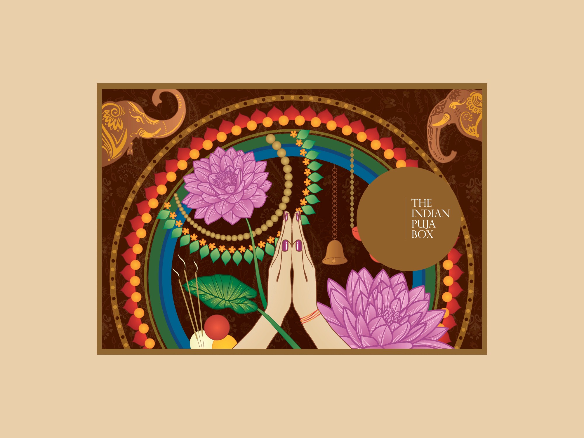
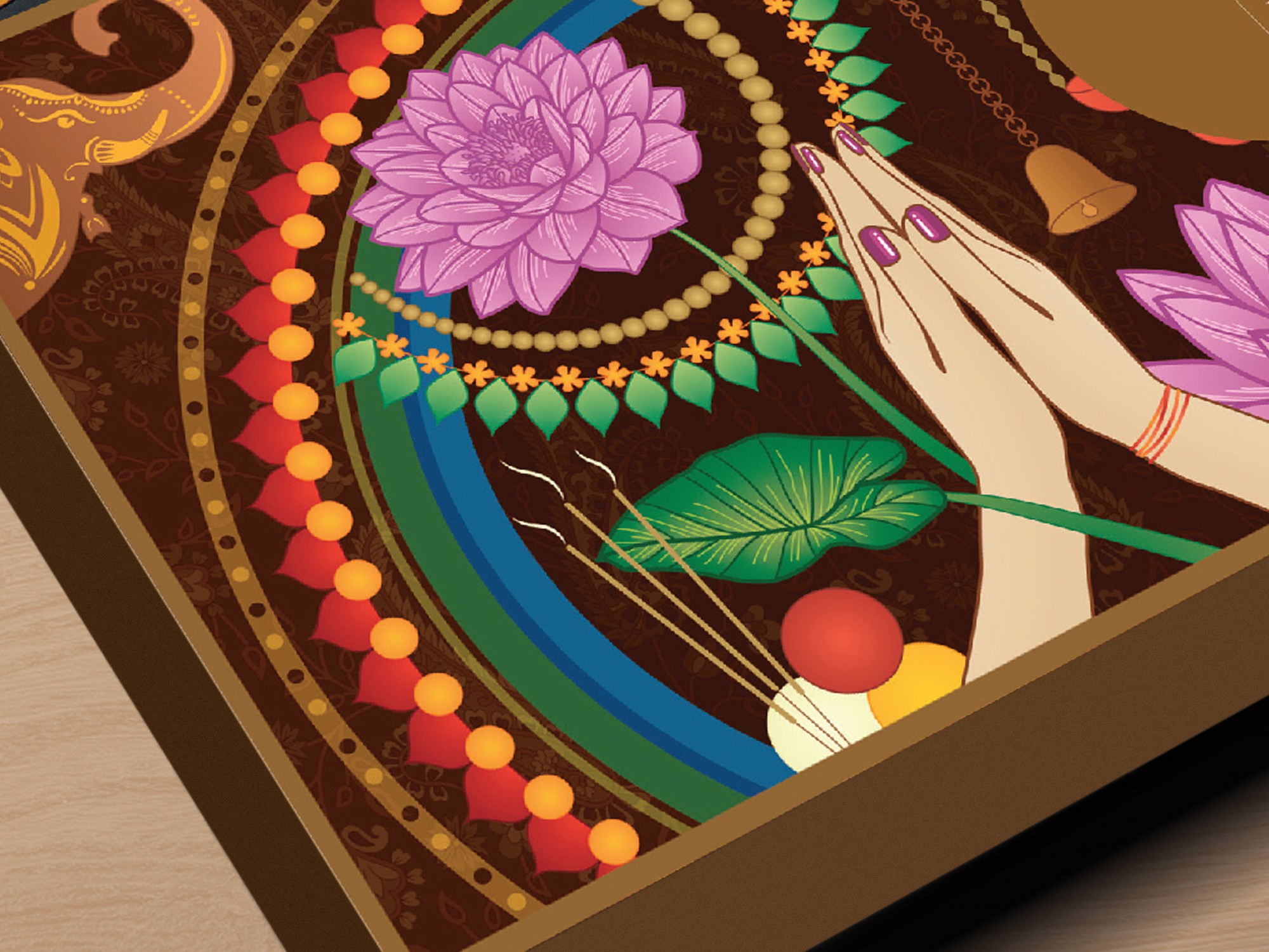
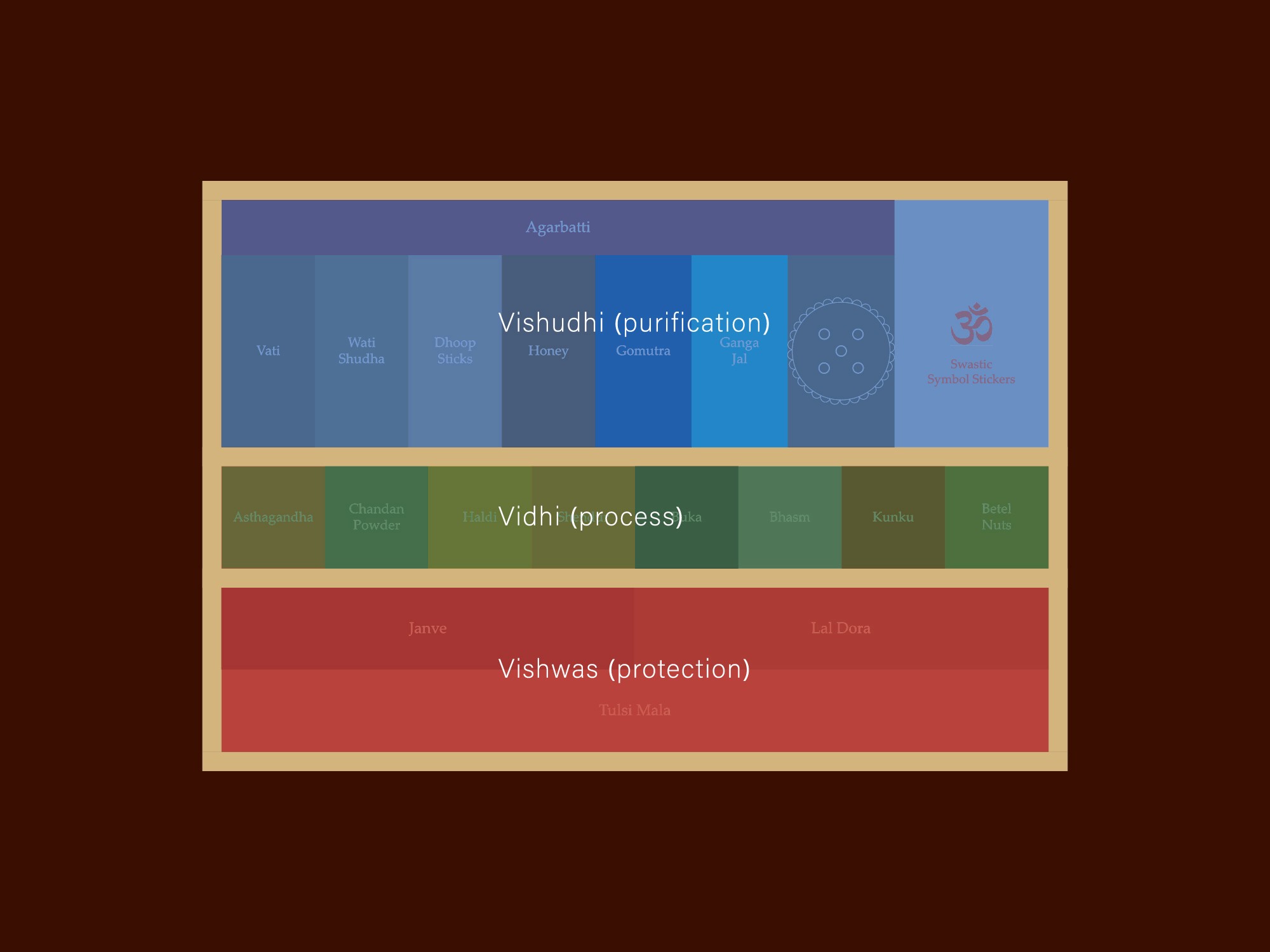
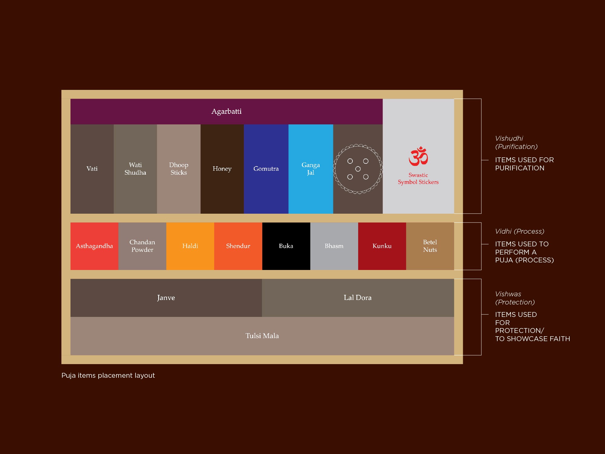
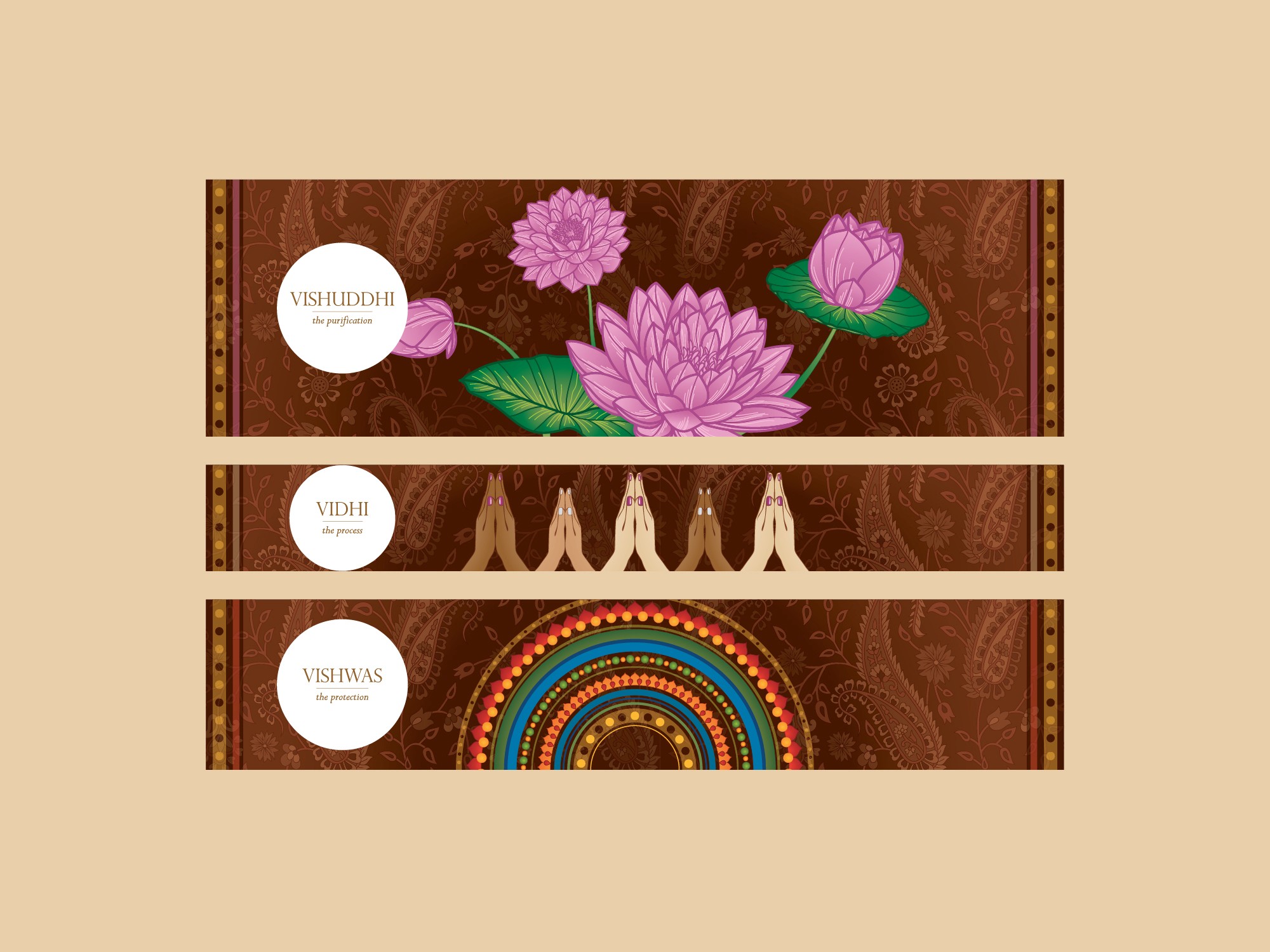
The solution involved translating the act of puja into a visual script. Items were placed in a precise sequence reflecting the spiritual order of use: starting with Gangajal and Gomutra for purification, followed by powders and pastes for ritual application, and ending with enduring tokens like Tulsi Mala and Janve. This structure mirrored the inner journey of worship. Illustration played a key role in embedding traditional motifs and sacred symbols into the packaging. The top-view layout was composed to resemble a mandala, creating a visual metaphor for spiritual focus and expansion. A culturally resonant palette of saffron, deep red, turmeric yellow, and charcoal black was chosen not just for aesthetic richness, but for the deeper values each hue carried within the ritual context. Typography, iconography, and ornamentation were developed to bridge old and new, rooted in Vedic tradition while feeling refined and contemporary.
The Result
The Indian Puja Box brought clarity and intentionality to a timeless practice. The design system served not only as packaging but as a ritual guide — honoring the tradition while making it more accessible and emotionally resonant. The final product, while later adapted, retained the structure and symbolic integrity shaped during its design phase. Through form and meaning, the box offered more than utility, it became a devotional experience in itself, demonstrating how design can uphold faith, foster connection, and elevate cultural expression.