
Overview
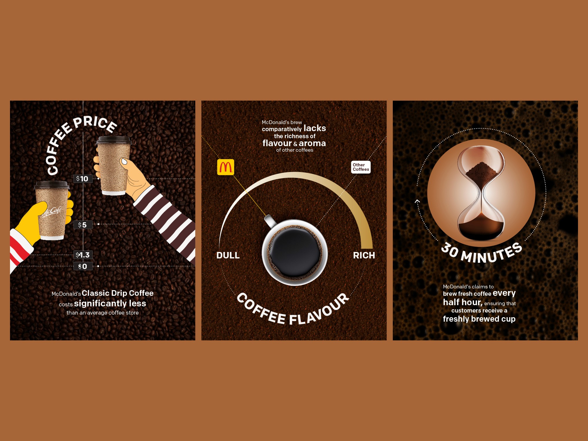
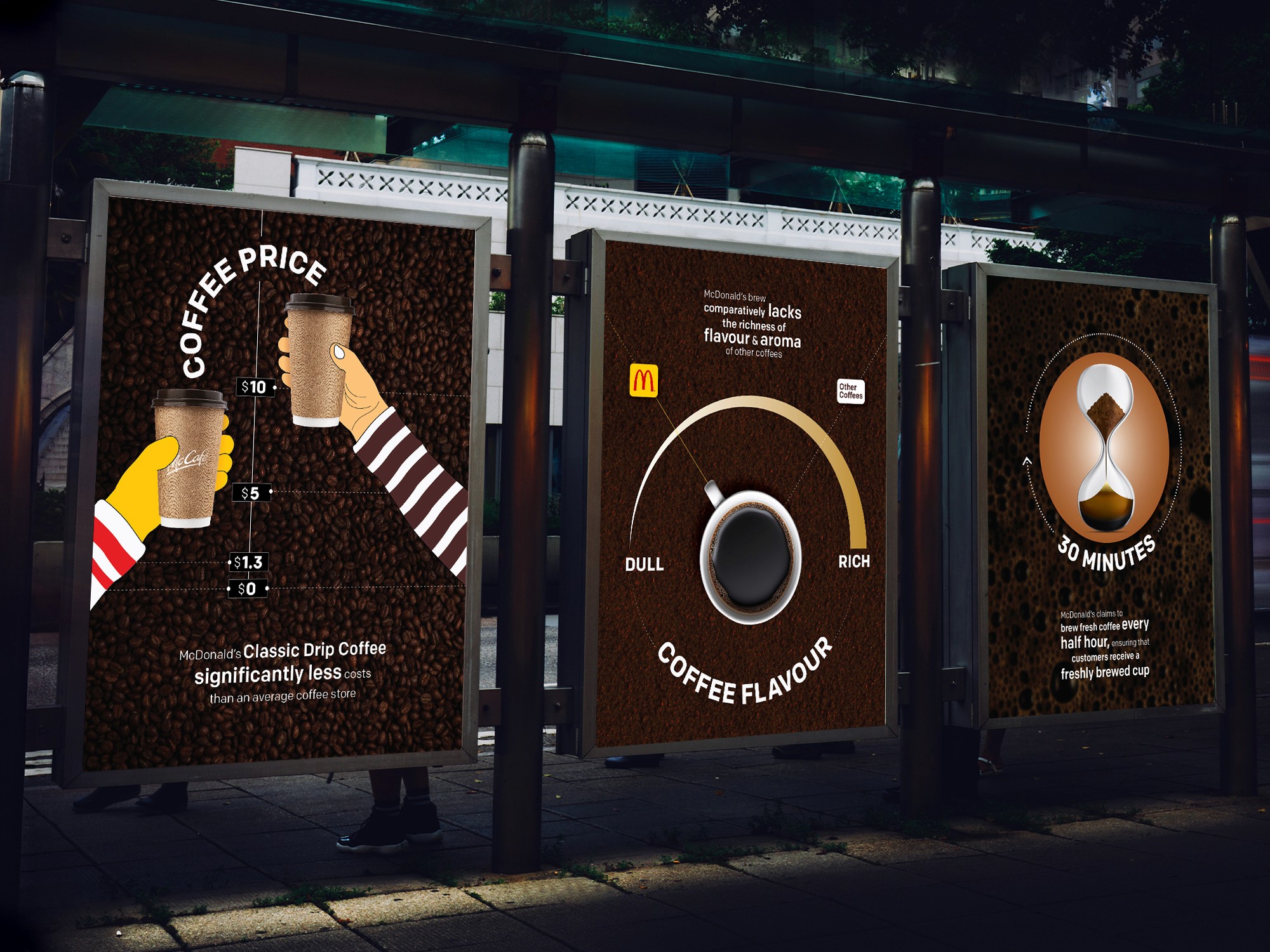
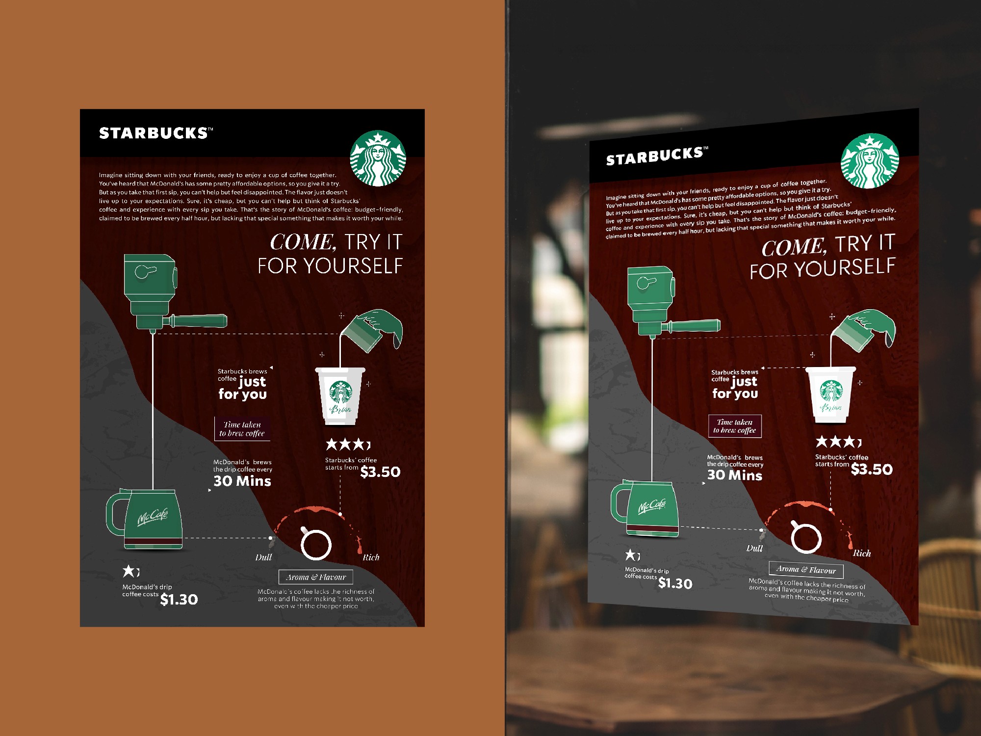
With a wide range of coffee options on the market, brand loyalty and surface-level comparisons often shape consumer choices more than facts do. This project uses data visualization to strip back branding and compare McCafé and Starbucks objectively and subjectively, highlighting the persuasive power of design in shaping everyday decisions. Part 1 presents neutral, factual information in favor of McCafé, while Part 2 reinterprets the same data to cast doubt on its value, inviting viewers to reconsider what makes a good coffee worth its cost.
Skills Used
Data Visualization
Advertising
Industry
Coffee Retail
The Challenge
Consumers often associate affordability with value without factoring in experience or taste. The challenge was to communicate the same dataset in two distinctly different ways, first as an unbiased comparison, then as a subtle critique, while remaining visually cohesive and digestible.
The Solution
The project is divided into two parts: Part 1: Inform – Uses neutral design and clear visuals to present McCafé’s strengths, focusing on pricing, brew freshness, and basic flavor qualities. Part 2: Persuade – Reinterprets the same data with a critical tone, questioning whether McCafé’s lower cost is worth the compromise on taste and experience, subtly positioning Starbucks as the better value.
The Result
The two-part approach highlights the power of framing in visual communication. By showing how the same information can serve different intents, the project reinforces the importance of media literacy in branding and advertising, encouraging viewers to look beyond numbers and question what they're being told, and how.